Steph from the Snowy Driveway has also done a logo for me, and like all things related to the Driveway, it kicks ass.
It's now up to you, the good people who actually waste your time reading this shit to decide between Rogers logo.
 And Stephs logo.
 I think it's going to be a tight race, but those of you who care can leave messages toting your favorite of the two by commenting.
I know I haven't been there for you guys lately, but there will be the weekly Halloween post later on tonight, and an in depth look the levels of Cougar-dom that resulted from a conversation with Satchmo, and that's coming up probably tomorrow or Tuesday depending how much work makes me die inside tomorrow.
So let me know what you think of the logos and check back later for #3 of the "it was a dark and stormy night..." series.


8 comments:
Ok, first off, I like them both. I think both are great.
Steph's captures a certain "Mike Hickeyness" with the faux-hawk, and in some respects the graphics are more engaging.
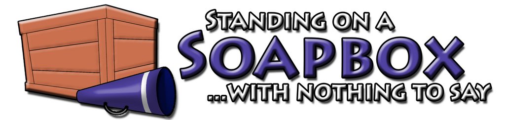
However, I would be remiss in not pointing out that the title of the blog indicates that you have nothing to say, whereas Steph's graphic clearly shows you saying something. Roger's placement of the megaphone next to the box reflects the title perfectly. Therefore, for sheer appropriateness, I go with Roger's.
In defence of mine, I think the fact that this is, indeed, a BLOG indicates that there is at least something to say. Whether Mike or his readers deem the content of value or not, it is still something.
PS > I vote for mine :P
Dennis has a point. A very valid one, but so does Steph, soooooo who to vote for.
I have to go with steph's. Keep Rogers though, use it in another way if possible.
I couldn't really disagree more with Stephanie's point. But, that's reflective of my belief that a logo should reflect the name, not the nature of the site.
Let me pick a silly sports analogy to demonstrate my point: The Toronto Blue Jays' logo is of a Blue Jay, because the name of the team is the "Blue Jays". If they followed Stephanie's rationale, the logo of the Blue Jays would be a man playing baseball, because that's what they do.
I think if Stephanie's logo had the character with the megaphone at his side, preferably standing on the soapbox, then it would be my choice. However, as it is, I can't vote for a logo which is in direct opposition of the name of the site. Imagine if the Snowy Driveway's logo was of a hot summer day! ;-)
WOW! First of all I want to give cudos to Steph for coming up with a very cool logo.
Maybe we can come to a compromise and use my logo for the banner and Steph's "faux-hawk Hickey" as the top picture on the blog.
I hate to be one of those guys who votes for himself, but hell, I don't want to lose either...
... Vote for me!
I'm obligated to vote for Roger's because he was the source of much amusement when we were working together at the EVEDC office. Amidst countless Subway breakfast sandwiches and Captain Black Sweets we did manage to get shit done. Roger also went to Acadia which gets mad props.
In all seriousness, though, the font on his logo is crisper, stands out more by highlighting the word "SOAPBOX", and is easier to read (at least on my screen). I also like that the box itself and the megaphone are grouped together. As Dennis pointed out, it fits the title much better.
So yeah, Roger gets my vote.
Still mourning the death of ICQ --Fudge
This might be obvious, but I cast my vote for rog's logo.
Steph's is pretty neat, but it clearly shows that mike not only has something to say, but that his words cause lightning to burst forth from his mouth.
While this might happen to Mike from time to time, it is in no way consistant enough to be his official logo... besides, it scares the kids.
-Chris-
Post a Comment